Confused yet?
???


Some of the topics we’ve explored so far seem to come with a dose of built-in confusion, especially Bayes’ theorem⌘ and, more recently, receiver operating characteristic curves.⌘ Before we launch our frail analytical boat onto the flood of medical deception (my next several posts), let’s tie the two together. With any luck, this will be the last tricky bit for some time.
I first encountered ROC curves about 25 years ago. I was working in intensive care at the time and I was miffed, because I felt that the wool was being pulled over my eyes about a specific test (serum procalcitonin). The problem was that I knew nothing about the Area Under the ROC curve, which was being used to punt this test. So I sat down for some time and acquired a little insight. Unsurprisingly, I found that yes, I was being bullshitted.
One of the side-effects of this exploration was encountering the aptly named 2x2 confusion matrix:
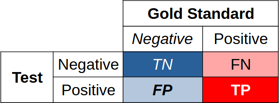
T is clearly True, F is False, and N and P are respectively Negative and Positive. We are really interested in true negatives and true positives; we need to balance these against false negatives and false positives.1
Bayes again
Consider our Bayes/breast cancer exploration,⌘ once more. Here’s the corresponding confusion matrix:
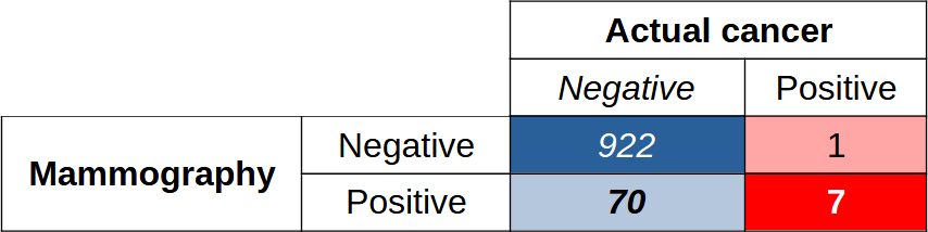
Among 1000 people, there are 922 true negatives and 7 true positives; the test misidentifies 70 people as having cancer when they didn’t, and misses one case of cancer. Nothing is perfect.
If you look at the numbers, most studies of mammography report an area under the ROC curve of about 90% or even better. This is a good statistic, on the face of it. But ... it’s clear that in terms of actual performance in real life, we may have to trade off ten times as many false positives for our 7 true positives. Not so great.
Another way of making this last point is to say that the positive predictive value (PPV) is 7/77, or about 9%. We work out TP/(TP+FP). Because statisticians have factions, another name for the PPV is the precision.
We’ve already met the confusion engendered by referring to the false positive fraction (FPF) as “1−specificity”, but not content with this, some refer to the sensitivity as the ‘recall’. Critically, high recall means that that we have few false negatives.
Got that? Yep. It’s a bit confusing, and takes some time to bed down.
ROC versus PR
Recall the ROC curves from my last post (Orangutans were tangentially involved). At the time, we also mentioned that there might be some teensy little problems if we unthinkingly just accepted them. ROC curves, that is.2
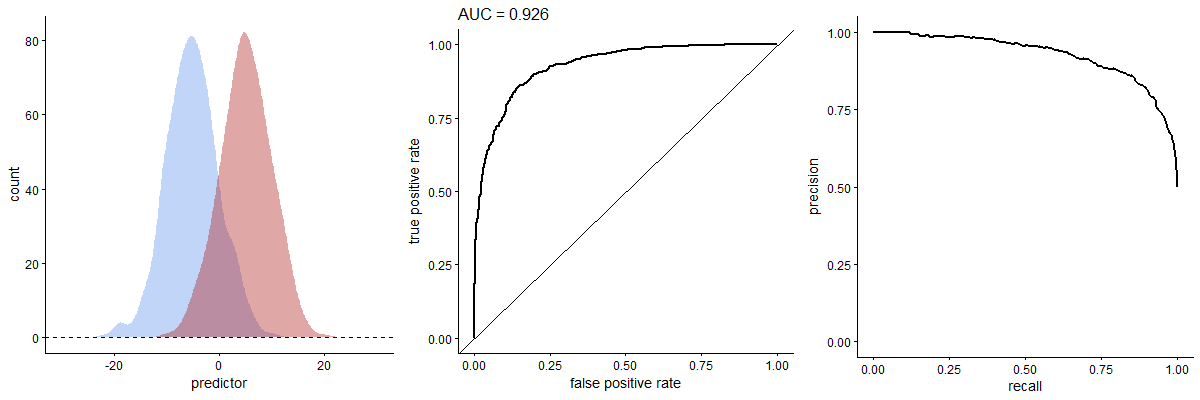
To recap, you create a ROC curve from the results of a particular test by plotting TPF against FPF (in other words, sensitivity vs 1−specificity). For our ROC curve, as we vary the threshold, we plot the TPF on the Y axis, and the FPF on the X axis.
The ROC curve is an assessment of how the test performs overall, regardless of the actual number of people with or without a condition. When it comes to comparing two ROC curves for different tests, there are still a lot of catches.3
The area under the ROC curve is most useful when the number of negatives and positives is similar. When the negatives outweigh the positives—as we saw with the Bayesian analysis of our breast cancer example—then the “area under the ROC curve” may mislead.4 Critically, two tests may have similar areas under the ROC curve, but behave differently in other ways.
In contrast, performance-recall (PR) curves just don’t care about true negatives. The precision (PPV) goes on the Y-axis, the recall on the X-axis.
Precision-recall
So. Precision (or PPV) is the proportion of correct positives out of all positive tests: Pr = TP/(TP+FP). You can see that “high precision” means few false positives. Recall is the sensitivity. As recall goes up, so precision will drop.
When the number of positives and negatives is similar (according to the gold-standard test), the PR curve may crudely resemble a mirror image of the ROC curve.5 But things change dramatically when there are, for example, few actual positives. In the above animated GIF, see how the relative numbers of actual positives and negatives has pretty much no effect on the ROC curve, but profoundly changes the shape of the PR curve. We already expect this from our breast cancer example. You can also calculate an area under the PR curve, or AUPRC.
Strangely enough in 2025 if you visit, say, PubMed and search for studies of ROC curves and mammography, you’ll find hundreds of hits. If you look for corresponding precision-recall curves, you won’t find many.6
Area under the PR curve is however creeping in. One study I found pretty engaging was that of Shen et al, who look at breast ultrasound (not mammography) and provide convincing evidence that here at least, AI can be a huge help in assisting radiologists, decreasing their false positive rates by over a third without harming sensitivity! And yes, these authors provide PR curve analyses.7
We see what we want to
Our tendency to use tests that give us reassuring numbers (like high areas under the ROC curve) is easy to understand. It’s our human condition—we’re prone to ‘attribute substitution’.⌘ It’s just another of the many types of bias we’re prone to.⌘ But we know how to deal with bias.⌘ We Science the hell out of it.
We’ve also already discovered that the data are mute.⌘ Every datum must be interpreted inside the context of our assumptions, including why these data were acquired, how they were acquired, and how they ought to be used. We can fix our tendency to naively ‘listen to the data’ too: Science the hell out of it.
In my very first post on Substack, I advocated that we do good Science.⌘ Science is about continually fighting our built-in tendency to see reality the way we want to see it. This naturally hurts a bit. Science concerns actively resisting the tendencies we see in most politicians today, people who justify their actions or even their intentions by retrospectively picking through the data and finding factoids that seem to fit.
It’s therefore not surprising to see the current active wave of anti-science behaviour and anti-science rhetoric (we can’t really call it “anti-science thought”). What is distressing and perhaps a little surprising is seeing similar behaviour emerging more and more in scientific journals.
Stepping back
Science is fundamentally about doing things better, with fewer errors and less waste. Nothing more. So who can argue with this? Seemingly almost everyone.
There are two main problems here, ignorance8 and a short term take on existence. It’s easy to trade off short term benefits for tragic long term outcomes; it’s easy to serve the interests of a few people and screw everyone else. When you combine these tendencies, you end up with a long-term mess for almost everyone. Unfortunately, it’s sometimes very convenient to shit in your backyard; it may be even more convenient to shit in your neighbour’s backyard, especially if you have power over them.
In the following posts, I’m going to explore a lot of bad science. I’ll look at people only pretending to do science in order to gain short-term advantages, either financial or academic. We’ll also encounter an immoderate amount of stupidity along the way, which will provide a huge learning experience.9
Why bother?
Brandolini’s law says:
The amount of energy needed to refute bullshit is an order of magnitude bigger than that needed to produce it.
It’s also known as the ‘bullshit asymmetry principle’. Refutation almost seems like a futile task.10 But this has always been the task of science. Within the infinity of ignorance and confusion that pervades the universe, we find things that work, at least well enough for our purposes, and stem the inexorable downhill flow of entropy for long enough.
Sometimes we have to take sides. Here, we have a choice. We can float out on the tide of darkness; or we can stay back, stand up, and shine a tiny light. I know which side I’m on. Do you?
My 2c, Dr Jo.
Rather provocatively, my next post is called ‘Sex, Lies and Robots’.
The image of a generically confused person at the start was AI-generated.
⌘ This symbol signifies another post of mine, where I explore the topic in more detail.
A confusion matrix is commonly rendered with the positives in the left column, and the gold standard below on the left; out of sheer bloody mindedness, I’ve done things differently. Flip it around as you wish.
The few remaining orangutans are very acceptable.
There is also the non-trivial matter of where to set the threshold. As mentioned in my previous post, your threshold for crying ‘leopard’ depends on whether you’re walking through a real jungle, or not. In a concrete one, other predators may be more of concern.
In addition, a ROC curve doesn’t care about weighting. The area under the curve may flatter the test if (say) there’s a huge penalty for missing a positive.
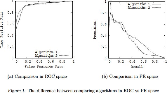
As Davis & Goadrich point out, the actual relationship between the two is subtle and tricky. A curve ‘dominates’ in ROC space iff it dominates in PR space; weirdly, you should not linearly interpolate in PR space! Their Fig 1 is revelatory:
Many apparently relevant publications turn out to be somewhat theoretical evaluation of artificial intelligence (AI) models. Some may be a bit dodgy.
Others too are catching on, for example the smart Finns, here’s a preprint.
Ignorance in the broadest sense. Ignorance that includes assuming bad but convenient models, ignorance about information, and ignorance about how to do good Science.
Quite often, once we’ve got over our astonishment at how stupid others can be, we find out that this provides a mirror, in which we can see how similarly stupid we’ve been. If we look.
Some argue that actually, it’s quite easy to refute bullshit. Mathematicians can often do this in a short sentence. They are however missing the point—you can easily refute it to your satisfaction, and perhaps even to the satisfaction of many smart people; this doesn’t imply that your voice won’t be drowned by the voices of a host, all propagating the same misinformation. (Here’s Bradolini’s original tweet, BTW. Nobody is perfect.)
Thanks, looking forward to it! For many years I’ve been a fan of Dr. Nortin Hadler, a former director of the U. of North Carolina’s School of Medicine and “a self-described refutationist (whose goal is) to educate the lay reader on how to avoid dubious and potentially harmful medical interventions…”. I discovered his books ‘The Last Well Person’ and ‘Rethinking Aging’ years ago, and recommend them to friends who are confused by the ‘standard wisdom’ offered by the American health care system. Here’s some background: https://www.med.unc.edu/medicine/rheumatology-allergy-immunology/people/nortin-m-hadler/
One thing I like to tell my students (and anyone willing to listen) is that metrics are perspectives on the data. They are by nature lossy, but by combining many different ones, and seeing where they agree and disagree we can build a better insight.
Also, to always compare with a baseline (defined as the simplest model that works), specially when working with very unbalanced datasets. It helps identifying overly optimistic metrics.