Perspective
The Finest Details of the Big-picture EHR, Part 7

 is a grayscale image of the Earth!")
I will have failed if, by the end of this post, you haven’t completely revised your view of ‘big-picture thinking’.
You know the spiel. Thinkers naturally fall into two groups “big picture thinkers” and “micromanagers”. Similar metaphors abound. ‘Lumpers’ and ‘splitters’. People like to lump. In a business meeting, managers will ask you to give a “30,000 feet overview”. People want “The main points”, or just say ‘tl;dr’. But is this take on reality right?
Let’s explore.
Some perspective
It may not be clear why the above contrast is relevant to the electronic health record (EHR). First, a recap.
We’ve covered a lot of ground. In my first EHR post, I outlined vital principles, including the most important of all: decouple the information layer from the functional layer.⌘ If the front-end software is tightly linked to the information structures, you’re buggered!
My second post⌘ described my job as a physician. I used this to lead in to how labelling often messes with people. The strangely popular No. 3 discussed abuse of time.⌘ Number four emphasised people,⌘ and touched on how catastrophically the big IT players mucked up ‘personal health records’. This led into the problem-oriented record,⌘ and how Larry Weed almost got things completely right. Then, those ominous, finer structural details⌘ that nobody really wants to look at. And now, some perspective.
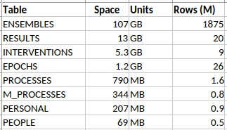
Take a look at the above. It’s a summary of some data tables from an anaesthetic database that I have at work, containing detailed anaesthetic data for about half a million patients, all fitted into the schema I described in my last post.⌘
That ENSEMBLES table looks a little threatening, with nearly 2 billion rows. It and the RESULTS make up most of the database. It seems reasonable to know what’s in those two tables. Small things, like individual blood pressure measurements.
Because it’s primarily an anaesthetic database, there are lots of sequential measurements, and they add up. As little things tend to. Just ‘cos it’s small, doesn’t mean we can ignore it. Bacteria are small.
Why bother about nitpicking detail?
Surely though, there’s some sort of ‘chunking’ we can do with lots of data like this. Or perhaps we could run an LLM over them? No need to sweat the small stuff.
Whether you’re a chemist or an electrophysiologist or a programmer, you just know that there are fine details that you pretty much need never touch. Do chemists need special relativity? Do electrophysiologists need to understand probability distributions? Do database designers need to understand the minutiae of blood pressure measurement?
Pretty much everything works in layers. Or so they say.1 I’m not so sure it works that way. Let’s begin gently …

Gold
That’s a confusing picture, isn’t it? Your eye is drawn to the gold bars on the left—much in the news, of late. The blue graph shows why: the price has more than tripled since 2020. But I find the fiddly little background graph most engaging of all. It’s the reflectance of gold (in red), wonderful, lustrous gold, compared to silvery metals like … silver and aluminium.
It turns out that physicists had a dickens of a time simply explaining why gold is, well, gold. Most metals are silvery because they reflect pretty much all visible light to an equal degree. It turns out that to explain the colour of gold, you need special relativity. Simply put, relativistic effects shrink the s orbitals, so they shift closer to the d orbitals. This means that gold absorbs blue light—cue its golden colour. In addition, gold is resistant to tarnishing due to similar effects, shifting its single outer electron into a safer spot closer to the nucleus.2 There is a devil in the details.
At this point, you should be unconvinced. You should be thinking something like “So what? I can still get a gold tooth, or buy increasingly expensive gold jewellery for my significant other, all without really giving a toss about quantum electrodynamics and special relativity. Meh.”
Now I could argue that there’s value in understanding, and being able to explain. But I think I can do better than this. Instead, here’s a story. Make up your own mind …

Shocking!
“It’s the volts that jolt but the mills that kill” [An old electrician’s adage]
Look at the ECG trace above. It was given to me by an ashen-faced cardiology registrar in the early 90’s. The patient had a temporary pacemaker—a pacing wire put into the heart. Can you see the pattern?
First, look at the top tracing at 13:30:00. The lower amplitude beats are the patient’s normal heart rhythm. But wait! there are wider, more bizarre beats, with a tall initial spike—an impulse from the pacemaker. It’s triggering pretty much at random, because it’s failing to sense the normal heartbeats.
Move on to the second row, ten seconds later. There’s a paced beat, a normal beat, and then, Blam! The pacemaker puts in a critically badly-timed spike, and the patient’s heart goes into ventricular fibrillation (VF), which goes on and on and on. That heart is no longer pumping. VF is a killer.
Electrical safety is important. Small details count. In the mid 1990’s, I worked with a professor of electrical engineering in evaluating the electrical safety of a very specific device that I likely still can’t talk about (It wasn’t a pacemaker). The big document here is IEC 60479-2,3 but we ended up with a stack of printed documents about half a metre tall. These weren’t entirely consistent.
Everyone agrees that running about 40 to 50 milliamps of alternating current (AC) through your body can provoke VF, which will kill you quickly. IEC 60479-2 emphasises a range of risk, which depends on AC frequency, duration, and the state of the heart. There’s no magical threshold here.
In contrast, many of the papers in that stack dealt with experiments on animals, where the emphasis was different: they talked about a ‘threshold’ for VF. These researchers deliberately induced VF, either to understand the risks better, or test new drugs that suppress the condition. Specialist electrophysiologists even did this, under highly controlled conditions, (electrophysiological studies, EPS) in people.
CAST
Again in the 1990s (a busy time!) there was huge enthusiasm for several new drugs. These were the “Class 1C antiarrhythmics”, with names like encainide, flecainide, and propafenone. The evidence looked good.
The concern was that after a large heart attack, rhythm disturbances are common. Sometimes these degenerate into VF. So electrophysiologists took people at risk, did EPS to induce VF, got them back again (by defibrillation), and then showed that at the same ‘threshold’, these drugs worked in preventing life-threatening arrhythmias.
Case closed? The drugs were rolled out to hundreds of thousands of people, but belatedly, a study was done. The Coronary Arrhythmia Suppression Trial, or CAST. The results were devastating: these drugs doubled the death rate, killing 6% of people in a year.
Current theories suggest that these drugs stabilise the heart against minor disturbances of rhythm, but that when major rhythm disturbances occur, they stabilise the major rhythm disturbances too. These then degenerate into VF. Wisely, we don’t use such agents in people who’ve had heart attacks. Anymore.
But
And all of that may well be right. The following is speculation, but I can’t get a particular paper out of my mind. It’s called A reappraisal of ventricular fibrillation testing, by Young-Mei Cha and colleagues, published in 1993 in the American Journal of Physiology. In our half-metre stack of papers, there were many that described “how to test for a VF threshold”. Cha found 70 such articles. They all used an approach that assumes that there is a particular threshold at which properly timed current of specific intensity induces VF. Crank up the current until you reach the magical threshold.
When I read Cha’s paper, it blew me out of the water. Because it effectively invalidates every single one of those prior papers. There is no “all or none threshold”. There is instead a ‘probability density’ function that gives the likelihood of a shock causing fibrillation. If you use the wrong protocol, the ‘threshold’ you’ve just found may be pretty random. This has implications.
Minute details can transform how we see the ‘big picture’. And how we behave. This works for medical data, too, especially when it comes to data structures.
Just write down the BP, then
High blood pressure (HBP) is the number one killer of people around the world. Over two thirds of my readers will get it, and it will then contribute to many of your deaths, due to heart failure, strokes, kidney failure, peripheral vascular disease, burst aneurysms and heart attacks resulting in ventricular fibrillation.
But we have good treatment, and surely simply measuring, recording, and diagnosing HBP is easy, right? How does it go? “Systolic” / “diastolic” and that’s it?
There are a few catches. First up, like ventricular fibrillation ‘thresholds’, blood pressure varies. A lot of HBP is therefore missed, and many people get put on treatment unnecessarily,4 especially if measurement is sloppy, or the blood pressure measuring device (‘sphyg’) isn’t traceably calibrated.⌘ There is worse to come.
A non-medical database designer might just build a database containing fields for ‘systolic’ and ‘diastolic’. With, naturally, an appropriate timestamp; a way to identify the patient; who took the BP and where (both anatomically and the geolocation); the device used (and even links to its calibration); the units of measurement; the context; details of amendments, and so on. Blood pressure seems easy.
It isn’t. Don’t take my word for this. Check out some of the coding systems. SNOMED CT has 248 active conceptId codes with “blood pressure” in the term, and 49 for “arterial pressure”. LOINC (“Logical Observation Identifier Names and Codes”) was devised in 1994. This covers not just labs, and all sorts of other clinical codes. You can look them up here. Try “blood pressure”. I did this today, and I got back 586 codes. Entering “arterial pressure” gave 105.5
We’re back to a familiar problem: the poisonous complexity of constructs like SNOMED CT.⌘

Planning requires knowledge
Let’s explore BP a bit. I’ll ease the pain with sub-headings.
Normal BP. The normal way to take a blood pressure is to put a cuff around the upper arm, with a bladder over the big artery there (the brachial artery). You feel the pulse and pump up the pressure in the bladder, and at a certain point the pulse disappears, as the pressure exceeds that inside the vessel. Listening with a stethoscope, you gradually drop the pressure, which brings us to the …
Korotkoff sounds. The pressure inside your arteries varies with the heartbeat. As you drop that pressure in your cuff, the heartbeat just becomes discernible: duf, duf, duf, duf. You record this as the ‘systolic pressure’, also called ‘Korotkoff phase I’. As you drop the pressure, eventually the sounds disappear—Korotkoff phase V. By WHO definition, this is the ‘diastolic pressure’.
Interestingly enough, some researchers found that the actual diastolic pressure (measured using a cannula in the artery) corresponds more closely to Phase IV, when the sounds muffle. But the WHO chose Phase V because the average clinician can identify it more easily, and it’s usually pretty close to Phase IV.
Another catch is Korotkoff phase II, where the sounds soften again. In some people this is so pronounced that they even disappear (an “auscultatory gap”). Clearly the incautious clinician can miss a very high blood pressure if they’re in a rush and don’t check the sounds against the pulse.
Are we done yet?
No. But if you’re tiring, you can skip this section. Consider my point as made.
The mean. If there’s a maximum and a minimum, then there must also be an average over time—the mean arterial pressure. When we’re watching the BP carefully under anaesthesia or in intensive care, we tend to obsess about this average, rather than the extremes, especially as there are some measurement issues that can affect the other values (overdamping or oscillation).
Automated devices. Which brings us to fancy, automated blood pressure monitors, which are now prevalent. Mercury sphygs have been phased out, because of, well, mercury; we’ve gone anaeroid. Increasingly, we also rely on automated devices, which have a few catches. The first is that they pretty much universally use inscrutable algorithms to work out the mean pressure—and then use extrapolation to give you a systolic and diastolic.
If you check these devices against manual measurement, in a small percentage of people, they are way out. That percentage rises rather a lot if other conditions are present. For example, an irregular heart beat (commonly, atrial fibrillation) will cause the systolic and diastolic pressures to vary with each beat. Humans are OK at identifying this sort of variation and compensating for it. Machines, often less so.
In the condition of aortic regurgitation, where the valve between the heart and the aorta is leaky, the diastolic pressure drops a lot. Here, the Phase IV and Phase V pressures can differ greatly, with the Phase V sometimes dropping to zero if the leak is severe.6 Your automated machine may struggle here too.
Varying pressure. We’re still not done! There’s a lot more information to be had from the BP. Normally, your systolic BP drops a few mm of mercury when you breathe in. In some conditions, this can be more marked—notably with severe asthma, and with the condition of constrictive pericarditis, where filling of the heart is limited due to stiffening of the covering of the heart (the pericardium). We call this ‘pulsus paradoxus’; in intensive care, people on ventilators experience ‘reverse paradoxus’, and we’ve found that this variation has implications for volume status and even prognosis—whether you’ll survive your ICU experience.
You can see that blood pressure is gloriously complex.
But does this matter?
Yes. The 30,000 foot approach to design is to cater for the main features (systolic, diastolic, have some codes) and say “Good enough”. The 80/20 rule.
The problem is, the fat tail of the rest of the data wags. This occurs in two ways. First, you end up with a proliferation of codes. The 500,000+ concept identifiers in SNOMED CT. The 100,000+ LOINC codes. Now if you want ‘blood pressure’, you may have to search through hundreds of codes—and decide which are relevant.7
But worse is to come. If you haven’t designed well, then adding features breaks your design. This can happen in many ways. For example, you may end up adding extra fields—for things like ‘mean arterial pressure’, ‘auscultatory gap present’, ‘Korotkoff phase IV BP’, ‘pulsus paradoxus’, and so on.
There is however something worse. It takes us right back to that fundamental principle of decoupling the functional layer from the information layer.⌘ Here’s that diagram again:

Design
There’s a sore temptation here. Simply take the complex structures and codes used in the functional layer—and plonk them into the information layer. Most major medical databases succumb to this temptation. Some can’t even see the problem. But this violates our fundamental ‘loose coupling’ principle. Functional structures change. Every small addition, every extra type of result or change to the way we do things, will force revision of the information layer, breaking compatibility and adding poisonous complexity. Or progress is impeded because the changes are just too hard.
All of this is unnecessary, provided you understand those tiny little details, and design accordingly. Small things bleed upwards.
So what do we do?
“Obsession is its own reward”. (LA Hopley)
Over the past 40 years of doing Medicine and exploring physiology, whenever I’ve dug into the details, I’ve always found people making incorrect or unreasonable assumptions about the basics. Often, with major implications for ‘higher levels’.
This may seem incongruous with my emphasis on the big picture of Science.⌘ But if you step back and think about it, pretty much everything in life is non-linear. We’re all familiar with the old story that begins “For want of a nail …” All good scientists do is to emphasise repeatedly that this is a never-ending story.
It’s abundantly evident that modern healthcare is in a mess: overly complex, badly joined up, and producing sub-optimal results. We may just have found out why!
Whatever our field of endeavour, all the ‘levels’ we create are convenient crutches. We’ve seen that this is true for Medicine; but it’s equally relevant to computer programming, chemistry, physics, evolutionary biology, and even ‘abstract’ fields like mathematics and philosophy.
We need to understand the full depth and breadth of our discipline. Often, to do so, we need many people, not just talking to one another, but communicating well. We need to sit down clinicians and database designers and get them talking. Then only can we do things right. Here are a few principles that I think will help:
Don’t impose unnecessary structure on your data.
Where there are multiple dimensions, don’t hide these in complex codes.
Ruthlessly eliminate superfluous codes.
All of this boils down to understanding the details of your data.
In the next post we’ll try to close the design circle, using the evidence (RESULTS) for causal reasoning. Subsequently we’ll ask about the role of AI, and finally we’ll end off by looking at the defective front ends of a lot of medical software, and how this too can be done better.
Yeah, I know, tl;dr.
My 2c, Dr Jo.
⌘ This symbol is used to indicate posts where I’ve discussed the flagged topic in more detail.
Obviously, rocket scientists are an exception! It’s not just Ariane 5, but also things like the O rings on the Space Shuttle boosters that clearly demonstrate that rocket scientists need to obsess about details continually. Try SCE to AUX.
In fact, it was only in 2016 that physicists finally came up with a numerically solid model. A smart New Zealander called Peter Schwerdtfeger worked this out at Massey University in Auckland.
Currently this will set you back about €450.
Especially if you live in the USA, where the ‘threshold’ has been lowered based on pressure from pharmaceutical companies. We’ve talked about this.
Their criteria are pretty broad, so a fair number of those codes are only peripherally related to actual BP. Have a look through them!
This connotes a bad prognosis.
Testing ‘OR’ conditions in database queries is expensive, but deciding on the relevance of information squirrelled away inside a complex code is far, far more demanding.
Just a brief comment from a patient.....my BP is more consistently taken/read when done manually -- by an experienced nurse, with my left arm (right is verboten, due to a mastectomy) in the correct position. We've been tracking it for a while and it's been fluctuating but only super high once when my appointment was screwed up and I spent an extra hour waiting and fretting.
OTOH, with slight exceptions, I read a fair bit higher on those damned automatic machines. My working hypothesis is that I'm conditioned to expect pain, and pain hurts--the cuff gets very tight before it starts releasing. This weirdness extends to the home automatic devices. I can't get a decent reading on them--even when i've spent time with the nurse in the office, calibrating and practicing.
As your essay points out--the manual method is less and less used--I'm just grrateful that my clinic still has that available.
Yeah, I don't do well with automated blood pressure devices due to congenital heart issues. Thankfully, my previous heart failure nurse was well up to date with the research and always took manual readings. I meet my new one tomorrow - I hope she's as good.