Quixotic
Fixing the EHR, Yeah Right! Part 8.

; on the left, a modern computer interpretation of the same.")
One of my favourite pictures of one of my favourite characters drawn by one of my favourite artists is above, on the right.1 You may or may not like it. Google Nanobanana rendered the image on the left based on Claude’s detailed description of the original.2 Did the machine do worse or better?
To recap. In my most recent electronic health record (EHR) post,⌘ we determined that you can’t understand the big picture without grasping the small details. We can rather arbitrarily ‘chunk’ things, but minutiae bleed into the big strategy. We now come to the hot core of how to get things right.
Paperless
This is a post about favourites, stereotypes and mockery. It’s also about improvement. One of my favourite iconoclastic books is the myth of the paperless office, by Abigail Sellen and Richard Harper (MIT Press, 2002). An academic work. It examines paper. I have a paper copy.
It isn’t some sort of Luddite attack⌘ on the advantages of computerisation, though. It’s a formal study of how we use paper, how the concept of a ‘paperless office’ arose, and how people have interpreted it.
The authors explain that early on, it became ‘obvious’ to many at Xerox that their PARC research lab seemed hell-bent on replacing their primary source of income—copying paper—with seamless, integrated computer systems that would, well, eliminate paper. This mostly didn’t happen.
One of the major initial reasons for this continuation of paper initially seemed to be the widespread introduction of word processing without connectivity. The tech didn’t quite work as promised; paper took on a role as a bridge. More was used. But what relevance does this now have, where everyone is connected to everyone else electronically, and postal services are in decline worldwide?
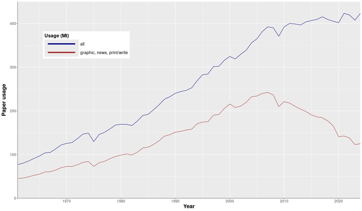
In the late 1990s, HTML and the Internet made promises about ‘paperless’: but paper consumption kept increasing! More local connectivity? More paper use. The graphic above shows that finally, paper for printing started declining in about 2008—but overall usage still grew. Projected to increase to 476 million metric tons by 2032, largely due to paper packaging. Uber Eats, anyone?
Paper seems to be extraordinarily resilient. Why? Sellen and Harper (‘S&H’, from now on) come up with a brilliant concept: paper has affordances. It has intrinsic properties that are useful, and support human activities in specific ways that can be difficult to duplicate using other technology.
In simple terms, you’re likely to get a different result, depending on whether you sit Picasso down with pen and paper, or sit him down anachronistically in front of a computer terminal. Or as S&H put it:
The physical properties of paper (its being thin, light, porous, opaque, flexible and so on) afford many different human actions, such as grasping, carrying, manipulating, folding, and in combination with a marking tool, writing on. … If paper is used to make different kinds of objects, those objects take on a different set of affordances.
Digital technology has different affordances: storing and accessing large amounts of information, displaying multimedia, fast full-text searches, related links and dynamic content modification. Simply put, understanding the different affordances of different technologies helps us with design. Ignoring them, or misusing them … uhh.

Mind set
Just as we discovered⌘ that Luddites weren’t actually anti-technology, simply wanting a fair deal, so we may find that people who question ‘revolutionary technology’ may not be opposed to it, but simply want it to be used correctly. We may also discover that sometimes an apparent ‘revolution’ isn’t much of a revolution.
S&H ask ‘Why?’ Why is paper useful? Why is paper often thought of symbolically as a hallmark of the ‘old’ that needs to be eliminated? They also look in detail at the limitations of paper, and the affordances of digital technology that are actually better. When and why is digital tech better? The threat here is that we may see digital tech as an end in itself, rather than embracing its strengths, and compensating for its weaknesses.
These authors don’t just put words on paper. They do research. In the study they ask why people prefer to read paper than screens: matters of markup, navigation and layout. They investigate how paper is used to gather and share information, support discussion, and archive information. They find paper use deeply interwoven with work practices.
And guess what? We now see that digital tech is deeply interwoven with what we do, but we still haven’t fully realised its affordances, or agonised suitably about what it does badly. In ‘abandoning paper’ and ‘embracing the future’, we may have ignored some important bits. That ‘heart failure alert card’ above doesn’t need batteries, functioning cellphone towers or an Internet connection to do its job. If we haven’t properly worked out how to handle allergies, perhaps the ‘Allergy’ stamp on the front of the folder was better after all? There’s more, too.

What are we missing?
Here’s the controversial bit. What I’m going to say flies in the face of much conventional wisdom about digital technology. Actually, I’ve said it already. It comes down to the phrase “Let the data speak”. We’ve already worked out that the data are mute.⌘ In some detail.
Current digital design, notably the design of health care records, strikes me as mainly about “letting the data speak”. We’ve also found out that even if modern EHRs give a nod to Weed’s problem-oriented record,⌘ they don’t do this in a scientific way. There’s that back-to-front emphasis on data, again.
But there’s something even more fundamental missing. Now’s the time to emphasise causality. You see, current EHRs don’t accommodate causality. This is very bad.
Good Medical Science
Good science is about making and testing models of reality that explain ‘Why?’. Good medicine depends on good science, which we can only do properly if we have some idea about how and why things happen. There are three main ways that we use causality in medicine:
We document causes. For example, we say things like “I started the anti-hypertensive drug because the patient has high blood pressure”.
We put forward causal assertions to be tested. For example, we say “This person has high blood pressure because they have overproduction of the hormone cortisone”. Often, these are a rich source of predictions.
We use our causal models for prediction. When we predict bad consequences, we can intervene to change the future. That’s the nub of medical science.
I’d suggest that most modern EHRs are pretty passive. Their design is built on a passive view of reality. The EHR acts as a recorder of data. The data must then mysteriously speak, and tell us what to do. We know this is wrong⌘; we know that this is, in fact, anti-Science.⌘
We need to ask the question “Why?” There’s also another great big causal opportunity here.
A causal affordance
We’re familiar with Bayes’ theorem. In a previous post, we explored a woman with a positive breast cancer screen, and saw how easy it is to get the odds wrong.⌘ Eleven-to-one against. We also puzzled over the simple formula …
… and realised that there’s a simpler way still:
Posterior odds = original odds × likelihood ratio
The catch, of course is that you need those original odds. This is covered when you answer the question “How sure are you that this is disease X?” We can then do relevant tests, and update our posterior estimate. But in order to do this, I first need to say how sure I am of my hypothesis.
The central question then becomes “Does my EHR allow for uncertainty?” Can I say what I think the odds are, or is the only option a Yes | No ‘diagnosis’?
I may want to say “I’m 80% sure this is multiple sclerosis” or “I’m 30% sure the chest pain is due to unstable plaque in the coronary arteries”. But if I can’t—my EHR lacks this affordance—I have a problem.
The big catch here is that I was not schooled in Bayes. I’ve only recently become aware of the need. And like me, most clinicians are not native Bayesians. Our EHRs are built to fit—giant, passive, windmills designed to grind data. Those vast flapping sails have inertia. And quite because we never asked “What are the affordances?” as we transitioned from paper to silicon, we missed important opportunities. Causal and Bayesian opportunities.

El Ingenioso Hidalgo Don Qvixote de la Mancha
The above diagram shows how to do better. We’ve explored it before.⌘ In red you can see the many-to-many associations between results and problems (‘supporting or refuting evidence’) and problems and processes (a causal explanation). There are also explicit causal links between problems, in the AETIOLOGY table. And it’s a small thing to insert a ‘certainty’ field to say how sure we are of a problem.
That old, bulky EHR is my windmill. Call me Don Quixote if you wish, a comical parody.3 But mockery can have powerful consequences: in writing about Don Quixote, Cervantes also gave birth to the modern novel.
I don’t mind being mocked for my windmill fixation, if you then go on to look for the affordances that should be present in profusion in your ‘modern’ EHR — and complain when you find them lacking.
Perhaps we’ll get a truly modern EHR out of this? That would be novel. But I have one more question for you …
That’s what we’ll talk about next.
My 2c, Dr Jo.
⌘ This symbol is used to indicate posts where I’ve discussed the flagged topic in more detail.
Image on the right is believed to be in the public domain in New Zealand.
_by_Pablo_Picasso.jpg)
I uploaded the image and asked Claude “Describe this picture purely from a technical point of view. I'm not interested in the author, provenance, etc. All I want is a detailed stylistic appraisal from an artistic point of view, and enough detail that an intelligent person could mostly redraw the image from the text description. Take as long as you need and write as much as is appropriate to meet the task.” I got back 1000 words that I then put into Gemini for that image on the left. Just for fun.
The ‘doctrine of courtly love’. At the end of the day, Don Quixote is a funny book, something that caused later, serious critics a lot of consternation. It is said that ‘quijote’ refers not just to ‘thigh armour’ but also, frankly, a horse’s arse.
I'm an air traffic controller. There has been a bit of a to-do lately among the political class because some air traffic facilities still have controllers using paper flight progress strips. But then, the political class doesn't really understand what air traffic controllers do.
My primary job is twofold, prevent bad things from happening (they kind of understand this) AND, arguably more importantly, when bad things happen, facilitate a "recovery" such that people do not get hurt (& they also like it when we keep the flights on time ;-).
No matter how good your technology might be, it will occasionally fail. Computer screens (with those lovely digital flight strips) can go blank. Paper strips can get coffee stains (try spilling your coffee on the computer & see how well it works) or they fall on the floor. You pick them up & you continue working the traffic.
Critical systems rely on resilience & recovery. The more complex the systems, the more fragile they become & the more dependent on them we can become. Have any of you seen the movie WALL-E?
Re: the two surveys:
1. I never did care for Picasso, but then, de gustibus non est disputandum
2. I think AI will be used extensively in medicine and is positively dangerous to the patient. IN part, this is this fault of what we laughingly call 'intelligence' in AI; in part this is due to the design of a medical system which purpose is to maximize profits, not health. When all other cost-cutting measures have been used, reducing the number of people who must be paid is the American way. AI's promise, from the corporate perspective, is just that: get rid of the expensive doctor in the equation Failing that, limit the doctor as much as possible so that they can see more patients in less time.