


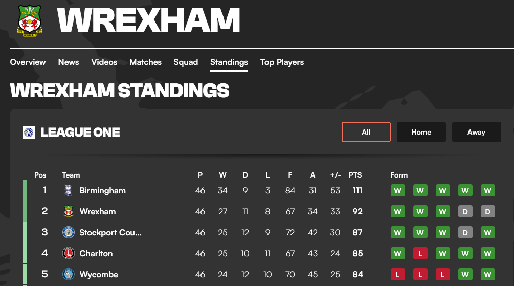
Football is immensely popular—especially when there’s a story. For example, despite being the oldest club in Wales, and the third-oldest professional association football club in the world, in 2020 Wrexham was languishing in the fifth tier of English Football—similar to one of the lower circles of Hell—when it was bought by actors Rob McElhenney and Ryan Reynolds. Helped by funding, the 2022 docuseries Welcome to Wrexham, and perhaps a little luck, it’s shot up the rankings every year, and is now in the second tier of the EFL.1
As I write, the league standings are as above, taken from goal.com. League tables are so intuitive, aren’t they? You know where your team is with them. So why not—here’s a thought—use them in health care? It seems so obvious.
A Health League
Does encouragement work? How do we take criticism? How can we do better? Some years back, at my own hospital, there was a push to encourage doctors to counsel patients about stopping smoking—based on studies which showed a minuscule benefit.2
From a past post we already know the solution, which is economic. As Deming points out, most of our behaviour is conditioned by the system. Politicians can fix this—by controlling the flow of commodities into communities. Here, nicotine. So what could possibly go wrong when we try to bully doctors into working harder, using a league table as a visual aid?
Here’s the league table we were shown (with the speciality names blurred out).

It’s obvious, isn’t it? ‘Clearly’, the specialities at the top are doing well, and those at the bottom, uhh, perhaps they need some chivvying along, right? With the Minister of Health and the Director General breathing down their necks, it certainly seemed like this to senior management.
Not so fast!
There are a few rules when cudgelled with this sort of presentation.
Get the raw data
Ask about their provenance
Are they complete?
If there’s a target, where did it come from?
Are they being read right?
It is only once we’ve done this that we’ll fully understand the true horror of what is being perpetrated here. I ended up debating this table at a Grand Round with a very senior clinician—a TBiLT. A True Believer in League Tables. I won by popular vote, but (spoiler) lost in pretty much every other way, because I didn’t yet understand the most important lesson. Few of us do.
As this post may involve some statistics, if this scares you you can simply scroll down to the very end for that important lesson. If like me, you enjoy learning a bit along the way, you may wish to at least skim the following.
So here are the data. I’ve de-identified de-incriminated the various specialities, replacing their names with colours randomly chosen in R.3 For convenience, we’ll now refer to ‘team colours’, rather than ‘specialities’ or ‘departments’.

Ask for provenance
You can see an obvious problem, already. The hugely successful orange, darkblue, yellow and hotpink teams see just a handful of patients a month. Sometimes just one. Or perhaps—just perhaps—the data are incomplete.
Incomplete!
And when we ask about how the data were acquired, well, they were from the computer record, relying on completion of an “Advice” Yes|No field. We aren’t told how many fields were incomplete, nor how many patients the different teams actually saw. The sampling then becomes a problem. Even with apparently larger numbers, we can’t say that lightgrey really did better than, say, sandybrown, if the missing data are not “missing at random”. There may be selection bias.
We should best stop at this point—but let’s accept the challenge to debate, and move on ...
Target, schmarget
Look again at that first graphic with the nice blue rows. Can you see the red line—a target threshold? The general rule here is simple, it’s Goodhart’s law.
When a measure becomes a target, it ceases to be a good measure.
The 90% target was arbitrarily sucked out of some unspecified crevice, and its utility is in keeping with its origins, and more generally with Goodhart’s law. Another reason simply to stop the debate. But we’ll press on regardless ...
What does your gut say?
Do you think it’s fair, based on the data, to say that the orange team scored 100% success, while the linen team is a total failure, at 0%? This is obviously unjust—the sample size of one for each is just too tiny, quite apart from the possibility of bias. It’s a roll of the die! And when I reveal that “linen” is actually “Paediatric Haematology/Oncology”, you do have to ask whether it’s appropriate for them to spend ten minutes counselling a child about smoking.
But let’s compare the lightgrey team (on 83%) versus the goldenrod team (75%): the raw numbers are 109/132 and 9/12. A bit of solid thinking suggests that here too, it’s a bit cruel to say that “lightgrey is better than goldenrod”. Even 10/12 is 83%.
Our failure here is especially clear when we realise that we’re comparing each team against every other team, willy-nilly. Even a bad statistician knows that multiple comparisons are more likely to throw up false positives, at a given threshold. We need to put our thinking caps on.
Which brings us to a useful graphical tool. Here’s the replacement analysis I knocked together in Excel. Have a look at it before you read the blurb on ANOM below. Does it make intuitive sense? (The 95% limits are adjusted for multiplicity).

ANOM
I’d like to introduce one of the most visually intuitive—and also, one of the most neglected—tools in statistics. It’s called “Analysis of Means”. The basic idea is very simple. Start from a position of similarity. Assume that everyone is the same, unless we have evidence they’re different. But where do we go from here?
The “assume the same bit” is easy. Just take the average (mean) of the lot. That’s the horizontal red line in the graphic above. And for each team, we can calculate the range in which we expect to find the actual measurement, based on (a) that mean; and (b) the number of observations. That’s the range in blue. Simple.
Finally, we plot the actual measurements—the red dots. And you can see that for almost every discipline analysed,4 the red dot is within the blue bar—so they are all statistically identical.
But what about the ‘exception’? I would hope that if someone comes in a critically ill state to the Emergency Department, the doctors there would devote quality time to sorting out their stab wound, massive heart attack or severe sepsis, rather than taking time off to counsel concerning smoking cessation!
This is not the only use for ANOM, either. In many similar situations, where we’re comparing multiple groups, even experienced statisticians can make a cockup, but ANOM does the job almost effortlessly. Let’s briefly examine another example close to my heart.

A stab to the heart
A little while after the great debate above, I picked up a copy of the Lancet, a leading medical journal. I was specifically interested in the EuSOS study, which looked (mainly) at hard hospital outcomes of over forty-six thousand people who had elective surgery in nearly 500 hospitals in 28 European countries. The scary headline is that one in twenty-five left hospital in a pine box. As none of these were emergency cases, and pretty much everyone over 16 was included,5 these are pretty damning statistics, however you look at it.
But my eye was drawn to their Figure 3, which I’ve reproduced above. Something looked off. Specifically, how did they know that the UK was the right reference point? So I did a quick ANOM in Excel to explore my suspicions, using their same, standardised data. Here it is. (You can do something similar in R6).

Isn’t ANOM great? This tells quite a different story from Figure 3 in the Lancet. Latvia, Poland and Romania are indeed high—but results from multiple countries are unexpectedly good, under that initial assumption that everyone is the same. And at our appropriate limit for multiple comparisons (about 3.5 SD), Ireland is not an outlier, but Slovakia and Croatia are! The UK is also a poor reference point, as it’s over 3.5 SD off the average.
There were two other major issues with this paper, and in our final letter to the Lancet, after much agonising, we decided not to tweak statisticians’ tails by including an ANOM. Instead, we pointed out that their own analysis reveals that the UK is a poor choice of a reference.7
The most important lesson
“Winning my debate” was a pyrrhic triumph, for several reasons. Very few managers bothered to attend—and those that did, didn’t change their behaviour. Deming anticipates this—most of our behaviour is conditioned by the system. Those who criticise us and ‘encourage us to do better’ seldom take critical evaluation of their own work to heart—even when they’re shown a better way! Managers are as trapped as we are. Perhaps more so.
Similarly, despite my criticism of EuSOS being robust, valid and relevant, it changed nothing. In their response, the authors wave their hands, and that’s it. There is no re-analysis of the errors they made—that wrong graphic is still there to mislead. The study has been cited over 1500 times.
All along, I’ve not been that bright. I used to think that when someone comes to you “for advice”, they want an incisive analysis and a fix—even if this identifies areas of error. Their error. This approach is, of course, hopelessly naive. In my broader experience, here’s what most people want:
People who come to you with a problem generally want affirmation, not “a solution”.
If people who ask for help mostly don’t want to “science it”, then how much less amenable to refutation are people who don’t ask? Who are sure they’re right.
With league tables specifically, we’ve known for ages that they are a particularly poor choice when it comes to making solid comparisons. In 1996, Harvey Goldstein and David Spiegelhalter published a brilliant paper in the Journal of the Royal Statistical Society A (click on ‘PDF’ there for a download, note their Fig. 5) that highlights the abuse of such measures.
But the real kicker is the Discussion section after the paper’s end. A representative of the UK Department of Health has the first reply. She (a) argues that the public is too stupid for them to change their approach of publishing analyses that use league tables; (b) misunderstands and then attacks Goldstein and Spiegelhalter; and (c) claims that league tables are, after all, just fine.
This is frankly embarrassing. How can we do better in the face of this sort of manifest obdurateness? I’m not sure. The real ‘battle’ is not about Proof of Work. It’s not about convincing analyses. The big problem seems to be our tendency to believe convincing bullshit, especially the bullshit we ourselves have produced. In the face of this, sometimes it may be best just to wait for people to die—and even this may not be enough. Their legacy persists.
The dreadful irony here is that if we look at four-year-old children, they have the basic intellectual tools needed to work things out. It seems that the wheels fall off later. So perhaps there is hope if we get early education right? Perhaps newer generations can succeed, when ours dies off? Let’s find out in my next post.
Weirdly, “League One” is the second highest tier of the English Football League and the third tier overall, in the English football league system.
The available data suggest a 1–3 % effect on quitting, with 2–10 minutes of counselling; at the time the effect was thought to be even more modest.
I created the substitute TEAM colours in R by saying:
Clr <- colours(); sample( Clr [ ! grepl('\\d', Clr) ], 28)You can work out that this ‘randomly’ samples 28 of the built in colours() in R; grepl says whether a regular expression matches items in a list, and here we use \d to exclude colour names that contain a digit, like “skyblue4”; ! Negates.
In the ‘smoking counselling’ ANOM plot, I removed teams where the numbers were tiny and thus useless for our purposes.
EuSOS excluded obstetric, neurosurgical and cardiothoracic cases, for which well-established numbers are generally more available.
Here’s a very basic screenshot of the spreadsheet. It should contain just enough for you to do your own analysis of the unadjusted EuSOS data (adjustment is a bit more complex)

You’ll need to stack up values to make the plot. If you want to do something similar in R, there’s the powerful ANOM package. For the smoking data, you might say something like this (after saving a suitable CSV with the 3 named columns):
## install.packages('tidyverse')
## install.packages('ANOM')

library(ANOM)
library(tidyverse)
library(MCPAN)

setwd("D:/MostlyWrong")
smo  <- read_csv("smo_una_short.csv")
head(smo)
str(smo)
smo2 <- binomRDci(n=smo$TOTAL, x=smo$Unadvised, names=smo$TEAM,
                  alternative="two.sided", method="ADD2",
                  type="GrandMean", conf.level=0.99)
smo2p <- binomRDtest(n=smo$TOTAL, x=smo$Unadvised, names=smo$TEAM,
                     alternative="two.sided", method="ADD2",
                     type="GrandMean")
ANOM(smo2, pbin=smo2p, xlabel="Team", ylabel="Failed conselling",
     axtsize="25", axlsize="10")
Unfortunately the ANOM package isn’t compatible with ggplot2, and it does some uncomfortable things like constraining margins and not accepting extra parameters. Good luck with getAnywhere(ANOM), I say!
There is an amusing tale related to my EuSOS analysis. The largest Australasian Statistics Department is across the road from me—also the place where R was born. I went to their (then) free walk-in service, where the statistician declined co-authorship on the Lancet letter, and instead wanted to charge me money while she taught herself ANOM (I could have lent her my copy of Nelson—which kicks off with an example that literally involves watching paint dry). I politely declined, and found a couple of experienced New Zealand statisticians on the Internet, who understood where I was coming from, and quickly discovered proof of the outlier status of the UK in the EuSOS supplementary tables. We thought this would be less confronting, but in retrospect, perhaps we should have added in the ANOM. It’s so explicit, isn’t it?
I’m going to scoop my brain up and attempt to
resolve the ideas herein.
When I started working as a consultant I thought people were paying us money to solve their problems. I got a good shock when I got a customer that really didn't. They had a lot of issues stemming from their technical stack being hopelessly out of date, including literally not enough hours in the day to process all the data they need to, and not being able to hire people who knew any of that because people don't learn it anymore. But in all the conversations they just wanted to keep the same system, with some magic sprinkled on so it would fix their issues.
It was healthcare data, as it happens.
I was also helping out a friend with some analysis. He is a bioinformatician working at a hospital trying to predict certain clinical outcomes. His department is full of senior specialists that are pretty good at the clinical side, but not experienced thinking about large data sets. My suggestion was to come up with some plausible confounders and hope they can give us the real ones. (For example, if a patient is taking less medicine than prescribed it could be because they feel fine and don't need as much, or because they are doing poorly an the medication is affecting them). The risk I see is that I have no idea if my examples are any good or relevant enough so we get the clinicians thinking about it the right way, or they are so silly they will dismiss it.
Any tips there?